
Why use inclusive design principles?
A large proportion of the world’s inhabitants are living with some type of disability. According to the World Health Organisation (WHO), 16.9% of the population has a degree of visual impairment, with 3.7% of those suffering severe eyesight issues—including blindness. In fact, it’s estimated that about 15% of the population is living with a medical disability (physical, cognitive, sensory, etc.).
In the UK alone, around 7 million people of working age have a disability, which accounts for a potential spending power of roughly £212 billion. So, if your product or service has been developed without inclusive design principles in mind, you could be missing out on a significant portion of customer spend. Here are a few key reasons for considering the universal design from the outset.
1. Disability isn’t just a medical condition
Disability is often perceived as something that affects the human body. In reality, it’s an umbrella term for all kinds of impairments that result in limitations or restrictions to daily life. While “impairment” describes the way the body functions, for a holistic view of disability we also have to consider the lifestyle and social limitations that a disability can cause.
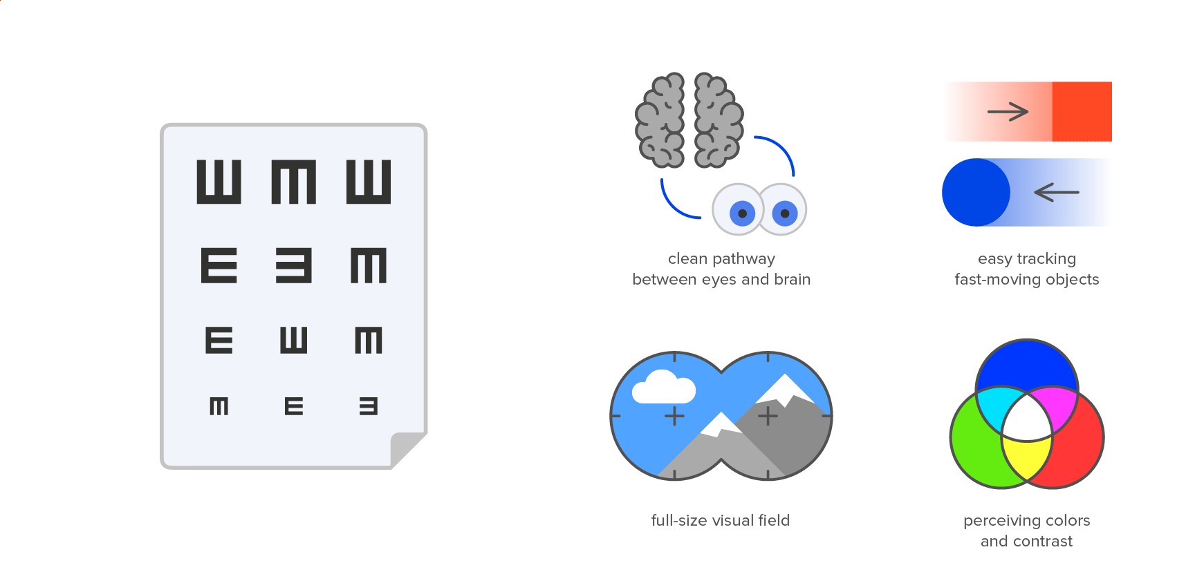
Vision clarity: what we consider the "norm" vs the factors that we usually miss out
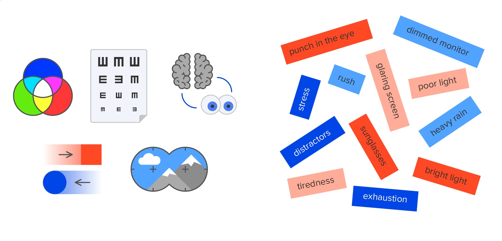
Additional factors that can effect your vision clarity
According to Microsoft’s inclusive design definition, there are three kinds of disability: permanent, temporary and situational. For example, if a person was born deaf, they have a permanent disability. Whereas the inability to hear for a month after otoplasty is temporary. And a bartender who works in a noisy environment has a situational disability. The first two are statistically quite rare, but the last one can relate to almost anyone and has nothing to do with bodily health.
These situational disabilities are becoming more and more common in modern society. According to 2016 research conducted by Common Sense Media, around 40% of teenagers and 26% of parents in the USA check their smartphones within five minutes of going to bed. And around 20-30% of Americans check their phones in the middle of the night.
What’s interesting about this is that it’s so far from the sterile lab conditions in which new devices are born. If you’re checking your phone from your bed, you’re most likely lying down, in the dark—possibly on one side with your smartphone in one hand. That’s not in any way similar to how product teams carry out their demos which, potentially, means that the end product isn’t taking into account situational differences that inhibit the product’s use.
To give another example, how often do people have to dim their devices to preserve battery life? In terms of usability, this isn’t a million miles away from a mobile phone user who has issues with their eyesight.
Now let’s consider the top-selling smartphones for a moment. They’re typically flagship models from big mobile brands. But perhaps surprisingly, the most widely used phones— according to Counterpoint Research—tend to be $50-$300 handsets and are often older iPhones and Samsung A-series. Does this mean, then, that designers are discounting some of the older design and functionality that makes a device user-friendly for a proportion of people?
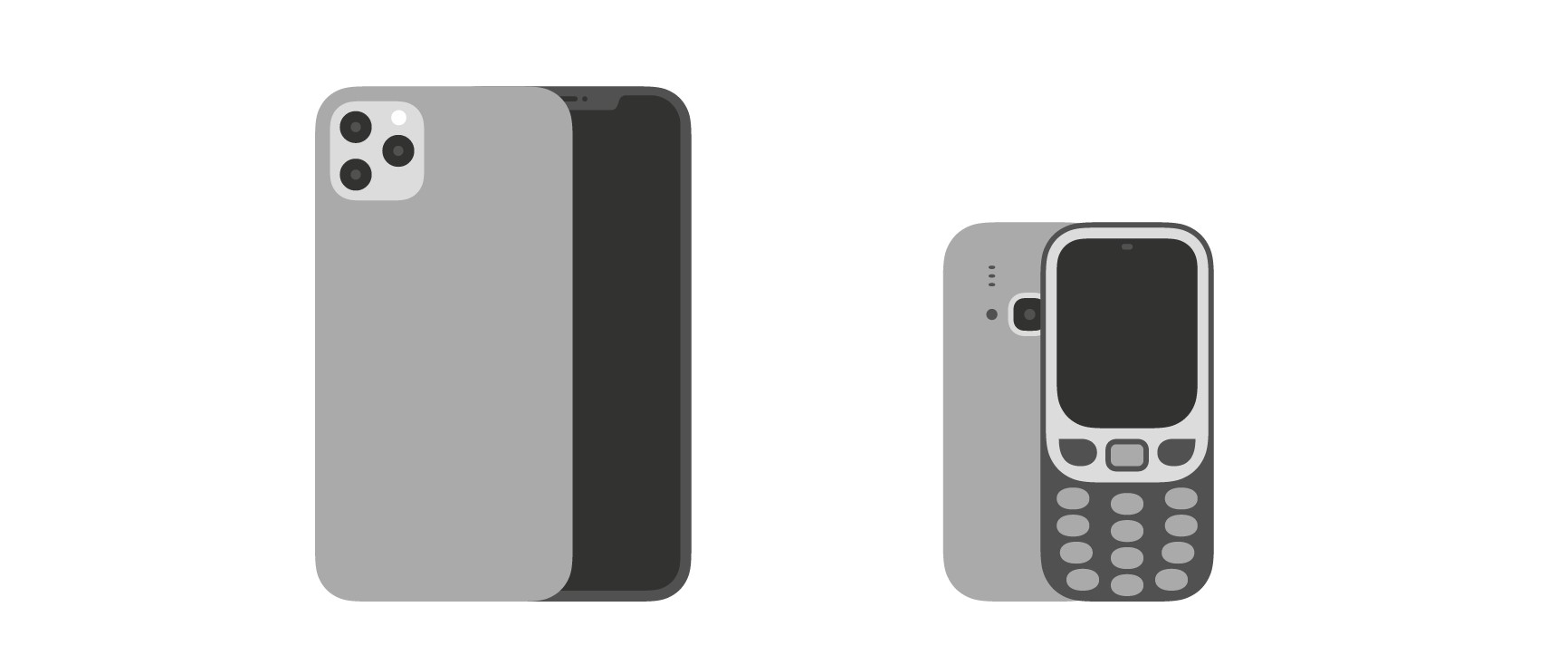
Smartphones that designers use vs end user devices
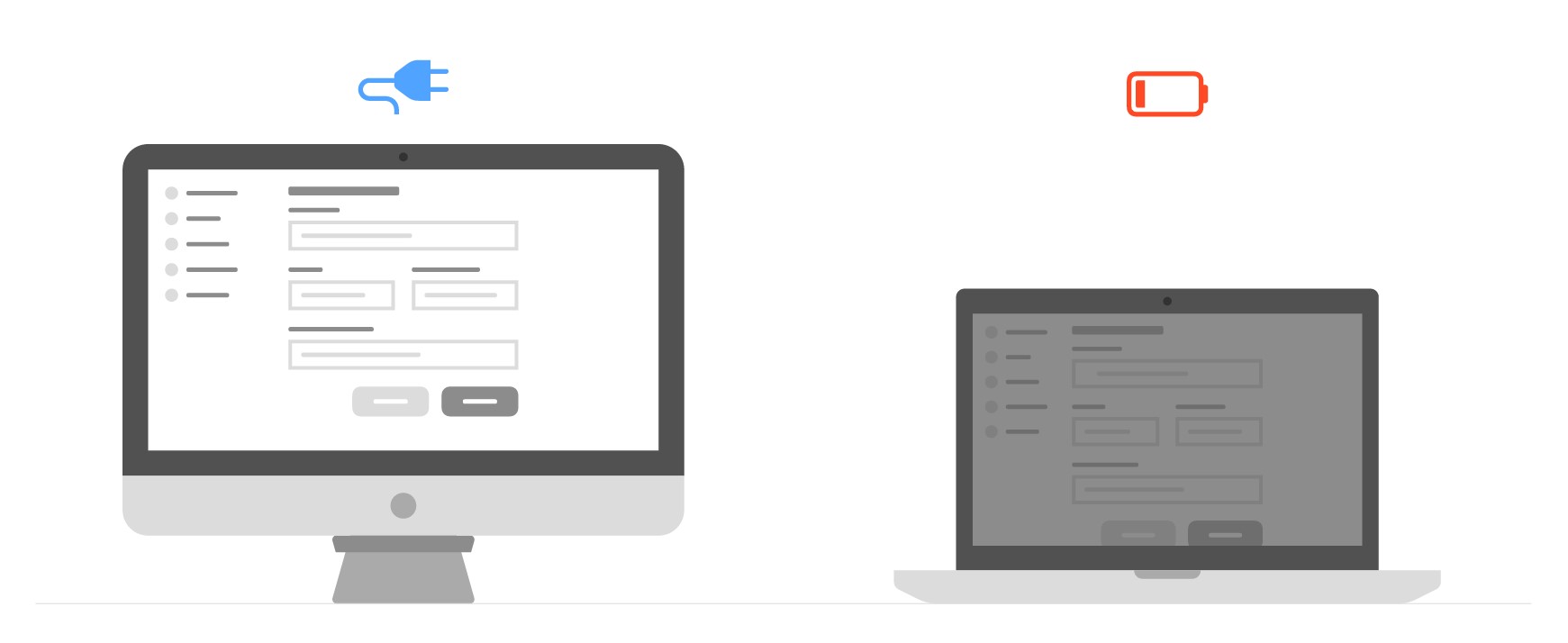
Full-brightness iMac vs low-battery laptop with reduced brightness
Smartphones evolve every year—screens get bigger and brightness improves to give us crystal clarity. But mobile interfaces, now more than ever, need to follow the principles of accessibility to be sure that they don’t hinder the user experience for a segment of the population.
2. Accessibility is harder to introduce as you grow
Accessibility encompasses one-time features and ongoing activities that define a product team’s development routine. Semantic coding and proper colour contrast are generally set at the beginning of a project, with follow-up later on. Alternative text for media, on the other hand, is generated incrementally when you publish new content.
Within the classic Agile “Cost of Change” diagram, the easiest stage for change-making is ideation, with the cost growing exponentially as you move through design, prototyping, development and launch. This is true for any feature, including interface accessibility.
If a site is poorly designed or developed, improving its accessibility to a decent level could mean full redevelopment. This represents a serious hurdle for a 10-year-old business that’s grown over time, maintaining hundreds of web pages and thousands of active user accounts. Moreover, a UI text debt will include captions for all media which involves building a special process for caption writing in future publications. On top of this, contrasts and fonts can vary widely across the site/app, so it’s unlikely they can be updated in a centralised way. Considering inclusive design from day one could help you avoid these issues.
3. Social responsibility is a brand differentiator
World-leading companies like Xbox, Microsoft and Dropbox have each implemented accessibility principles in their products. As global brands, they have a duty to care about all users, regardless of their health and personal circumstances. But what drives them? Well, it’s most likely a mix of wanting to operate in a way that’s socially responsible and needing to stay on top of compliance where equality, inclusivity and accessibility are concerned.
The best-known accessibility standard, WCAG 2.1, doesn’t require any implementation and presents developers with recommendations for making their products/services more accessible. And it’s inspired a set of national regulations which oblige global companies to offer accessible services and products. These include the EU standard EN 301 549 (2014), Section 508 of the U.S. Rehabilitation Act (1998), and the UK Equality Act (2010).
Even though it’s a relatively new legal field, we’re already seeing the precedent set. In 2019, there was a court case between Domino’s Pizza and a visually impaired man who couldn’t order online using screen-reading software. The Supreme Court rejected Domino’s petition of the ruling and later handed victory to the claimant.
So, where the law is concerned, businesses now have a duty to improve their social responsibility and deliver more to consumers than just high-quality goods or services.
How accessible is my product?
Anyone can check the accessibility of their site or app, without a background in design or computer science. We’ve put together a handy checklist of five simple steps you can take to check your digital product’s accessibility right now. Then you can go ahead and check whether it conforms to the World Wide Web Consortium’s advanced WCAG 2.1 standard.
Method 1: Use an online checker for colour contrast
Black and white give the highest level of contrast. And it makes sense that the most crucial elements of your interface—links, buttons, input boxes—be rendered in a way that makes them obvious and easy to interpret. That said, black and white might not be in line with your brand style.
What if your brand colour is orange, yellow, blue or pink? Can the button text be on a blue background instead of black on white, or vice versa? Does it make sense to have white buttons with pink strokes and pink text? Here, you need to consider both aesthetic and accessibility principles.
Here are a few ways to check your buttons and textboxes:
- Use button colour contrast checker Aditus, which studies publicly available web pages (this won’t work for closed corporate systems).
- Use colour contrast checker a11y to analyse publicly available web pages or colours, which you can enter manually.
- If you’re still building your digital solution, the plugin Stark—used by graphic editors—helps check contrast between any two elements and simulates colour deficiency. It’s compatible with Sketch, Figma and Adobe XD.
And here’s how you interpret the results:
- The minimal contrast ratio of the background and text, or other meaningful interactive elements, (e.g. icons without explanatory text) should be 4.5:1 or more.
- If you’re specifically targeting people with visual impairments, or a countrywide population, aim for more than 7:1.
- Only very visible, large text may have a contrast ratio as low as 3:1.
Method 2: “Magic words” to test your fonts
When it comes to picking the right font, there’s more than just good looks to consider. Your font should be clearly legible, relevant to the content, representative of your brand values, and relatively inexpensive to license. Getting it right is especially important if you’re not able to use a free font.
What works from an aesthetic perspective is open to interpretation, but font legibility has a more scientific definition—based on visible similarities and differences between characters. Here are two “magic phrases” that you can run a basic font check with:
- Iil| 6bdpq 0OD 9g 68B
- m1IIionalre
Type these character combinations into a web font service like Google Fonts or MyFonts, or edit the code in your web page using your browser’s developer mode. If the neighbouring symbols don’t look too similar to one another—in other words, if you can tell the “1” apart from the “l”—the font should be easily readable.
This isn’t the only way you can check legibility, but it’s a quick and easy option for filtering out bad choices.
Method 3: Assessing the distance and size of key elements
Paul Fitts, an American psychologist, created what’s known as a “human movement model”. Also referred to as Fitts’ law, it demonstrates that the time it takes for a user to move a pointer (e.g. a mouse cursor) to a target area is a measure of the distance to the target divided by the size of the target—the longer the distance and the smaller the target’s size, the longer it takes. Simply put, users will find it easier to reach a target if it’s closer and bigger.
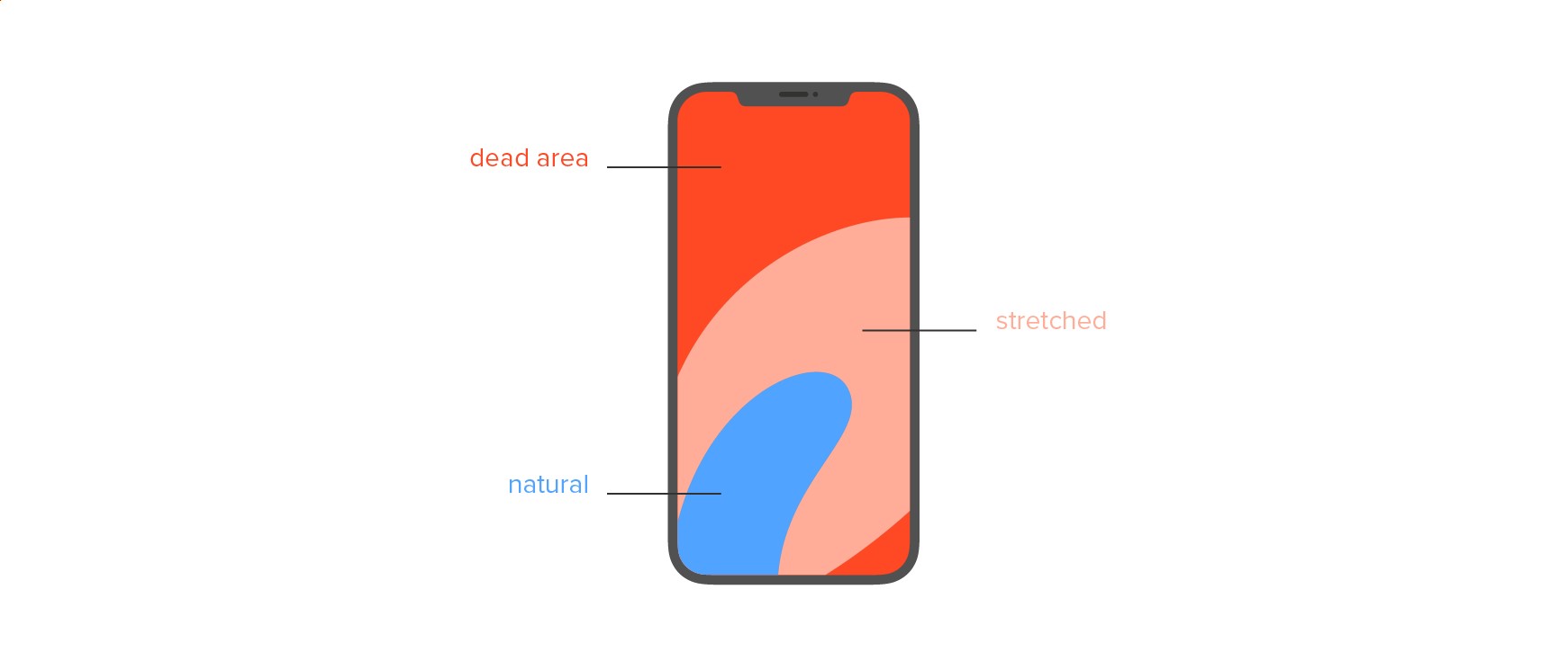
Standard thumb areas you can find in the design books
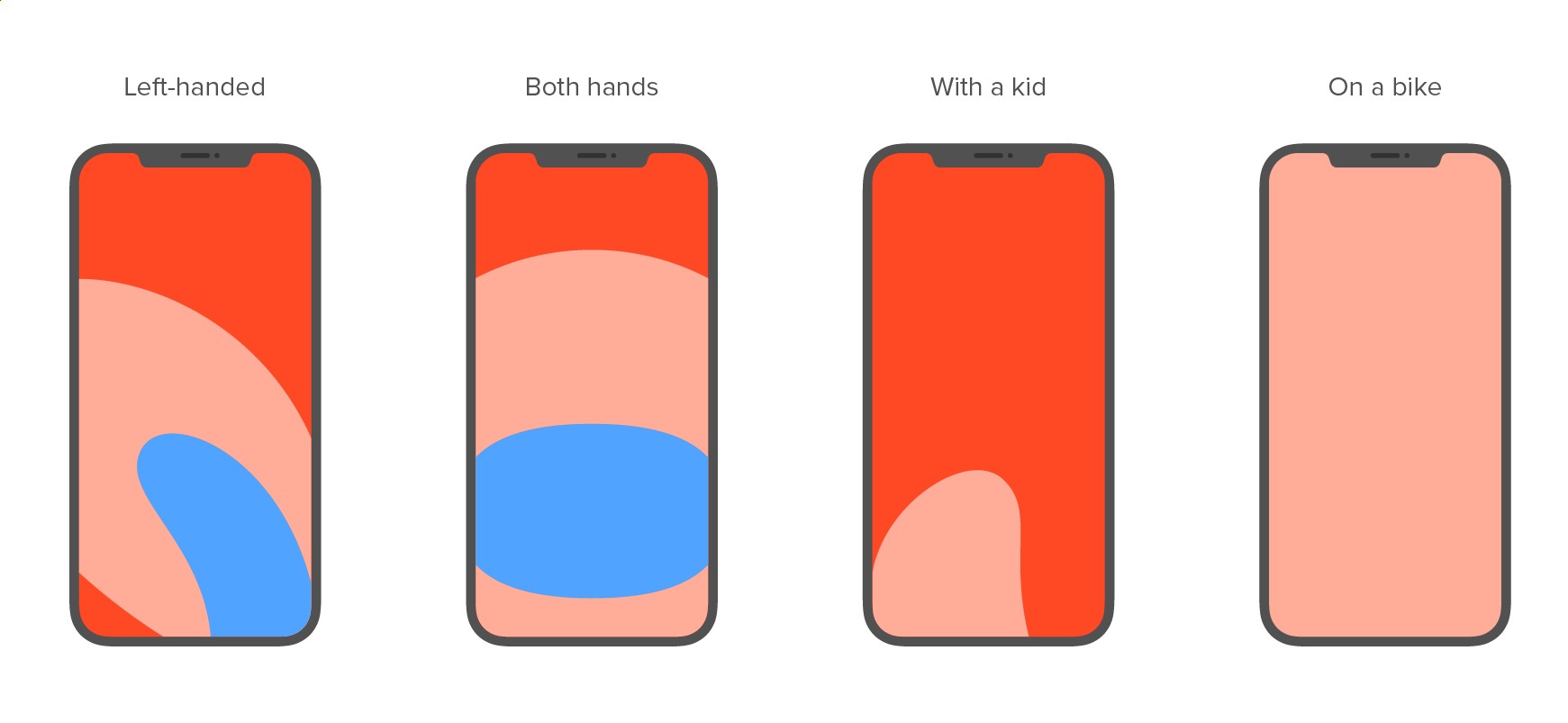
Real-life thumb areas
A target’s distance and size are interconnected. If a button, icon, link, textbox, etc. is small, it needs to be closer to the user’s focus; otherwise, it’ll take too long for the cursor to reach it. And if there’s no option to keep the button—or whatever the element might be—close to the main focal point/s of the interface, it needs to be bigger.
Here’s how you can apply Fitts’ law to your product:
- Place your finger on all the active elements on your smartphone. How much does a finger cover a button or an icon? Does it cover other buttons or icons at the same time?
- Open your site layout in any graphic editor that allows you to draw lines or print a page on paper.
- Think of typical user interaction and draw the lines between the most likely consequent steps.
- Analyse the result – How great is the distance between the user steps? How big are the near and remote elements that make up the interaction? How often do lines interject? Is it possible to move any related features closer together?
Method 4: User testing with your grandma
This is 100% serious. Of the 33 most developed countries in the world, only five percent of the population are technology literate. Only 25% have average skills when it comes to operating simple programs like Microsoft Word or Google Chrome, online shopping, or listening to music. Almost half (45%) only have elementary level proficiency—meaning they struggle with the tasks mentioned above. Furthermore, 25% of the population in countries like Canada, Germany, Japan and the USA have no computer skills whatsoever.
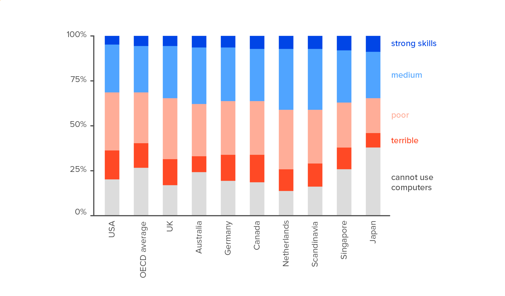
Distribution of computer skills among people aged 16-65 from the OECD Skills Research
That’s why it makes perfect sense to give your product to someone who’s not used to using technology. Bear in mind though, this probably only works for fairly straightforward apps/products. If you’re in the business of underwater welding or space shuttle configuration, your grandma’s highly unlikely to be able to get to grips with it! When testing on less technically-minded users, let them do simple actions and move through the interface toward a meaningful goal.
It’s also important to avoid dropping explicit hints which might influence their actions, like, “now you can press the red button.” For the best approach, try asking questions like “what do you see now? What action do you think you take next?” etc. The inherent user behaviour will tell you a lot more than words.
Method 5: Passing key test scenarios with a screen reader
Not only is this a fun exercise, it’s also a pretty reliable test for checking accessibility. If your digital product is live, try using it with a screen reader—embedded assistive technology that lets you walk the page without seeing it.
Under the hood, a site or app consists of hundreds of layers, and the way they work depends on how they were coded. People who are able to see without impairment rely on visual clues to help them understand the functionality. For example, buttons tend to be coloured rectangles with text which often change as you hover over them. But a person with visual impairment or temporary sensory disability, might overlook these cues.
A “Buy” button, for example, can be represented by a designated element (shown as <button> in the code) or a simple rectangle with centered text and a link (<div> in the code). The latter isn’t visible to screen readers, which typically interpret these buttons as plain text or a graphics caption. As a result, many crucial scenarios (purchase, sign up, booking) might be concealed from certain users, which is a business-critical problem for global products.
Now test your product:
- Switch on your screen reader. On Windows it’s called Narrator, on Android-powered devices it’s TalkBack, and Apple has VoiceOver. These features typically live in the settings, under “Accessibility”. We recommend taking note of the introduction that demonstrates how the reader works.
- Now, try navigating around your product and completing a key scenario with your eyes closed. For example, on an e-commerce site, the scenario could include search, comparison, adding to cart and payment.
- Analyse the process to see how straightforward it is. Can you finish the scenario without peeking? How clear were the elements the reader voiced for you? How many steps did you have to take? What was unclear without the ability to see the context?
Screen readers are a bit like ramps: initially installed for wheelchair users but, ultimately, quite useful for everyone (i.e. parents pushing strollers, a person navigating a bicycle through a train station). Screen readers are just as handy for listening to a long read on your daily commute as they are for helping those who don’t have the ability to read using their eyes.
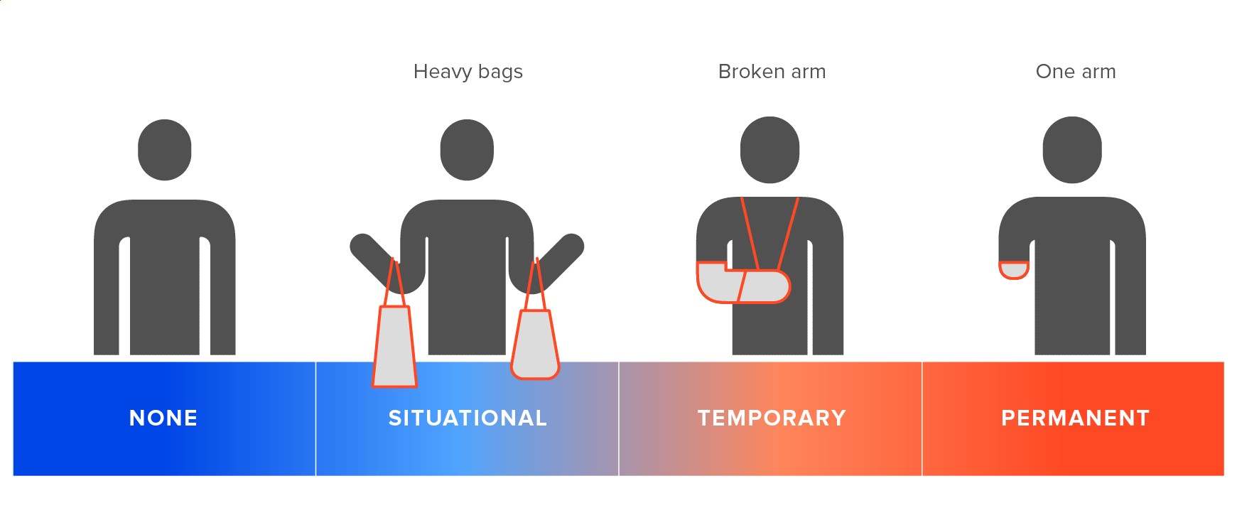
Types of sensory impairments
Key takeaways
Embracing diversity is essential for product developers of the present and future. Users of different ages and backgrounds are able to make very relevant suggestions for how you can improve your product. So get as many different people involved in testing your product as possible, by having them perform simple, meaningful actions with the interface. If a certain demographic loves the visuals but can’t work out how to add an item to their shopping cart, there’s work to be done.
With the average population age on the increase—and with more products and services moving online—inclusive design is going to be a fundamental part of all businesses. It gives organisations the chance to offer every customer the same level of usability and interaction, regardless of their abilities or circumstances. Any design that excludes a segment of consumers will inevitably fail to reach its full market potential.

FAQs
Inclusive design is an approach that ensures products, services, and environments are accessible and usable by as many people as possible, regardless of their age, ability, or circumstances. It takes into account the full range of human diversity and aims to accommodate varying needs without creating separate or specialised solutions.
Curb cuts, or sloped sidewalk edges, are a classic example of inclusive design. They assist not only wheelchair users but also benefit individuals with strollers, delivery workers with carts, and cyclists. Another example is video captions, which aid deaf viewers and those watching in noisy environments or learning a new language.
Exclusive design refers to products or environments that are created with a specific user group in mind, often excluding others from using them effectively. For instance, a building that has only stairs and no ramps or elevators excludes individuals with mobility challenges.
An inclusive concept is an idea or principle that promotes equal participation and access for all people, regardless of their differences or abilities. It embraces diversity as a strength and seeks to create solutions that work for everyone rather than just a privileged few.
Related Insights


The breadth of knowledge and understanding that ELEKS has within its walls allows us to leverage that expertise to make superior deliverables for our customers. When you work with ELEKS, you are working with the top 1% of the aptitude and engineering excellence of the whole country.

Right from the start, we really liked ELEKS’ commitment and engagement. They came to us with their best people to try to understand our context, our business idea, and developed the first prototype with us. They were very professional and very customer oriented. I think, without ELEKS it probably would not have been possible to have such a successful product in such a short period of time.

ELEKS has been involved in the development of a number of our consumer-facing websites and mobile applications that allow our customers to easily track their shipments, get the information they need as well as stay in touch with us. We’ve appreciated the level of ELEKS’ expertise, responsiveness and attention to details.

