DISCLAIMER: Tesla Motors Inc. was not involved and did not endorse neither the authors, nor Eleks Ltd. in the experiments and the application described in this article.
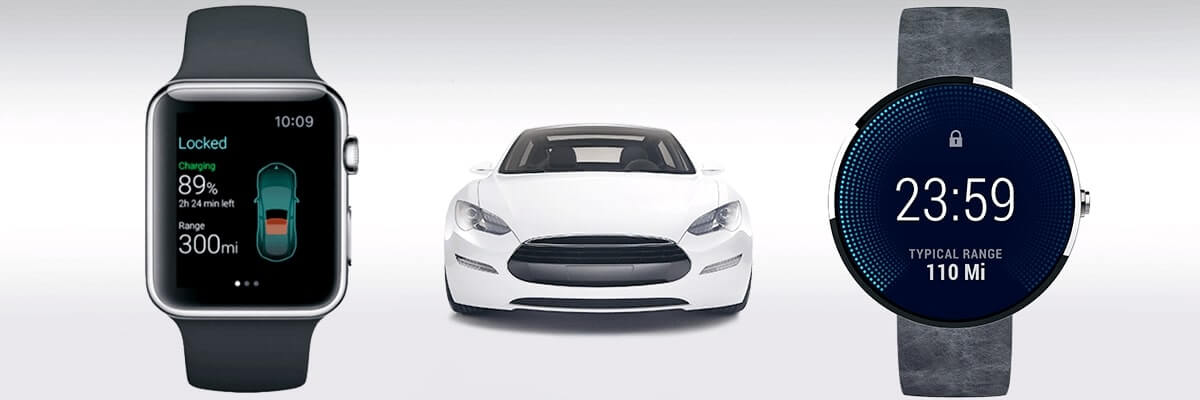
When our Apple Watch Tesla App spreaded out, we were asked by Google, some Tesla drivers and lots of other folks to perform something similar with Android Wear.
And so we did. In this article we’ll share our impressions from creating the same app for a different platform, talk about the possibilities and limitations of Android Wear for creating consumer apps and basically compare Apple Watch vs Android Wear in neat details.
It took us barely 4 weeks to go from the prototype to this demo, all thanks to the close cooperation of ELEKS’ UX gurus, Android OS ninjas and Tesla drivers. As previously, you can find the source code of this app at Github.
The Good, the Common and the Different
It’s interesting to observe how Apple and Google have approached smartwatch user interaction guidelines. Basically we can say that both tech giants aim to solve the same problem and highlight same usage patterns, but they take a bit different approaches. You’ll find keywords like glance, context-aware, seconds-long interaction, etc. in documentation for both platforms. But their interaction approaches differ significantly.
For example, Apple Watch’s home screen is app launcher, while Android Wear’s is watchface + notifications list. You can say that Apple is encouraging software application development, having Glances screen as second option, while Android put reacting to notifications at stake, giving apps second priority.
Another example are interaction methods. As we are dealing with an extra small screen and no keyboard, the platforms obviously have to offer some new way to input/read data. Apple has provided us with tools such as Digital Crown, Force Touch and People Button, while Google seems to rely on voice control and context awareness for most interactions.
After wearing Pebble for a while, we’ve figured out that physical buttons are more convenient for smartwatches than a tappable screen. Also voice interaction is very promising, especially in the context of rushing around with busy hands, as it often happens with a smartwatch.
Speaking of developer opportunities, we found Android Wear much more open to third-party developers than Apple Watch. With Android Wear you can make basically any UI tricks, create your own watch face and even make certain actions from your app launchable by voice (although this feature needs some improvements). With Apple Watch, you are quite limited (at least for now), just like we described in the previous article.
Also, two platforms strongly differ in architecture. Basically, Android Wear is a fully operational OS which can be used almost the same way you use Android, while Apple Watch only allows displaying data, leaving all the computations on the iPhone. This means that you can’t use Apple Watch without iPhone, while you can use Android Wear without an Android phone. The mystery for us is how did Apple manage to have only an 18-hour battery having a lot more battery-efficient architecture then Android Wear, which can last up to 2 days. Apple Watch’s architecture is similar to the Sony Smartwatch 1&2 platform, which used the same “second-screen” architecture years ago. This let them keep their devices alive for up to 5 days.
Anyway, let’s get into more details about our Android Wear Tesla App.
The UX Stuff
First of all, we analyzed which features Tesla drivers used most often and what was missing in existing apps.
The Killer Feature
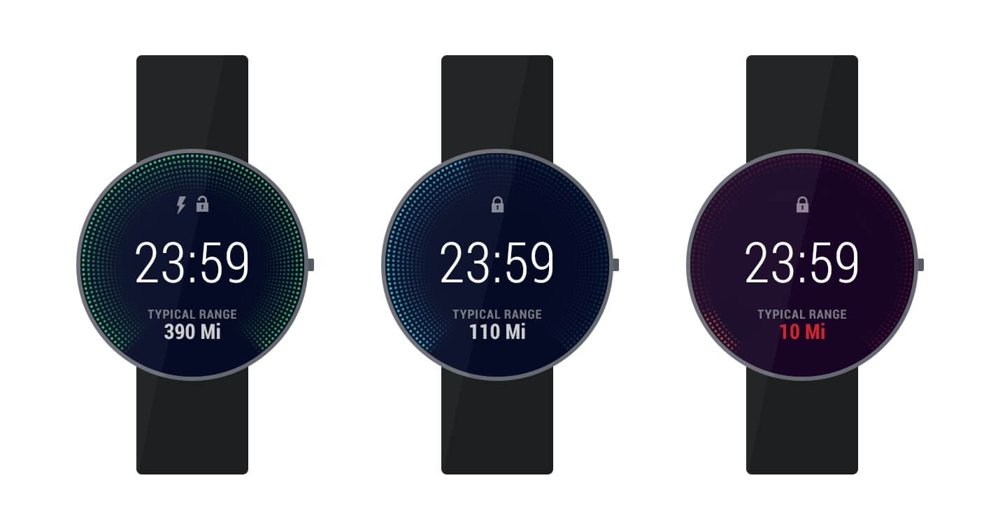
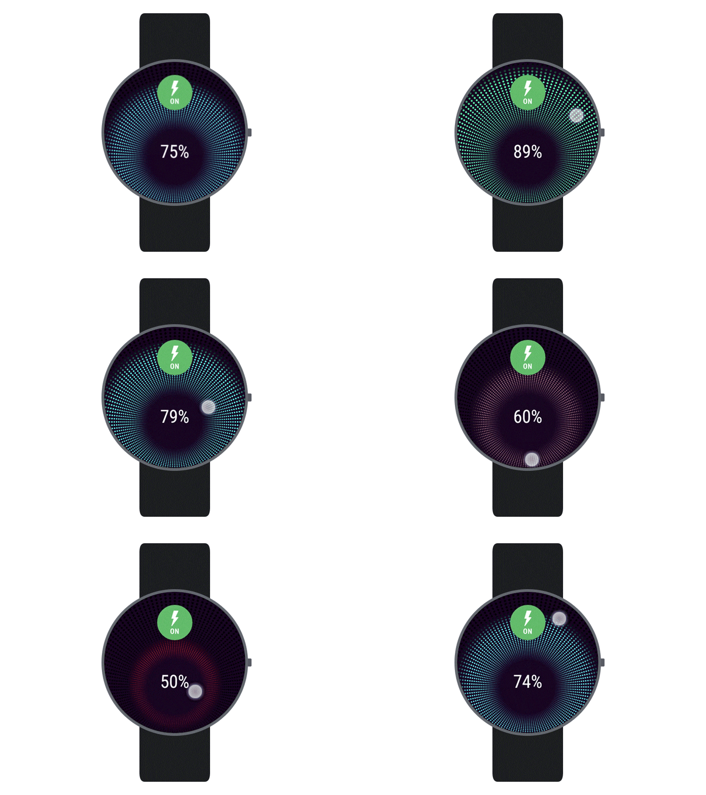
As our interviewees stated, the most commonly used feature in a Tesla mobile app is checking the charge status. That’s why we decided to make charging screen the main screen of our app, without yet knowing how the app will look. And this is where Android Wear granted us a killer feature - custom watchface. We realized we can connect drivers to their cars without even launching the app, so we created a custom watchface that shows the current charge level, estimated driving range and basic status of the car. We believe this screen alone could replace about 80% of interactions with the app by simply showing what users need all the time right on their wrist.
There are limitations though. Launching the app on watchface tap turned out to be impossible. Watchfaces are read-only, and it’s actually difficult to say whether it’s good or bad.
Android Wear watchface screen has similar functions to the Apple Watch Glance screen, but it is obviously much more convenient. Unfortunately, you cannot create custom watchfaces on Apple Watch for now.
Notifications
With watchface as the central screen of the app, we looked for further opportunities to leverage Android Wear platform to create richer experience. The philosophy of Google’s smartwatch platform lies in the “Suggest & Demand” principle. The “Suggest” part focuses on predicting user needs in a certain context and suggesting presumably useful information with optional feedback actions (i.e. notifications). The “Demand” part is simply an application launcher that responds to the user’s need for actions we could not predict. The “Suggest” part has to be used wisely: on one hand, you have to try to predict user needs and avoid additional interaction from user, and, on the other hand, you shouldn’t disturb the user over each detail.
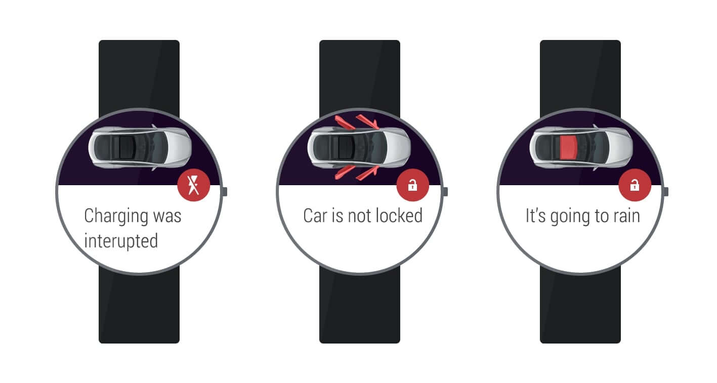
We asked ourselves: what are the most important notifications users should receive about their car? And with some feedback from Tesla drivers and a bit of creativity, we came up with a few. For rich notifications we found a very useful integration with 3rd party services like weather forecast, POI providers (Gmaps, Foursquare, etc.) and alike. Here are some scenarios where notifications can be useful:
- The car’s sunroof is open, and it’s going to rain soon. The user receives a notification with a warning and a suggestion to close sunroof remotely.
- The car’s door is open, and the driver has left the car. The user receives a reminder that they forgot to close the door and is offered to return and close it.
- The car is charging, but it was interrupted due to electricity issues. The user receives a notification with an offer to restart the charging and safely drive further, instead of wasting much time.
Looking back at Apple Watch, we also have actionable notifications. But in Android Wear the notifications are a central part of the UI, providing a convenient way to navigate through them and take actions after they’ve been launched. This is something between Apple’s Glances and notifications.
The App
After having the watchface and smart notifications, we still needed to address the “Demand” part: that 5-10% of interaction which still needed to be implemented.
The challenge was to fit into the design principles, including the 5-second rule and the big gestures rule, while still enabling the core functionality.
Our first approach was to use the Android Wear’s pattern “One screen - one action”, as we thought to simplify the UI. But it would take us 8-9 actions, i.e. 8-9 screens, and getting from the first to the ninth was a nightmare. We also tried categorizing actions and using 2D UI Picker, but navigating between items in different rows was still painful.
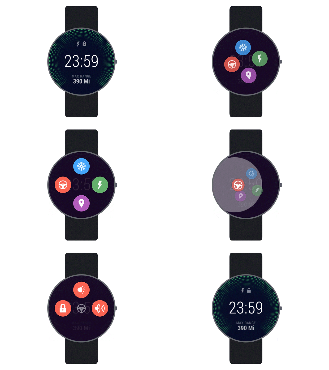
That’s when we decided to move several actions to the same screen, limiting the number of buttons to 4, to still address the difficulties of tapping a small area while on the move. In smartwatches it’s even more important than on mobile phones, as people use their index finger of right hand for tapping(assuming they wear watch on left hand), and the wrist is not attached to any stable surface, left floating in the air. This makes aiming for a tap much more difficult.
But even after choosing this approach, we had too many categories and subcategories, which didn’t fit into the design concept of maximum 4 actions per screen. Looking at bigger picture, we realized users won’t really need all of the features on the smartwatch because they still have mobile phones. A smartwatch is only needed for fast ad-hoc interactions, so we decided to reduce the functionality by merging the driver’s and the passenger’s climate control into one, leaving the sunroof control for notifications only and reducing details.
We categorized actions into 4 areas, with each category having up to 4 sub-actions. This pattern inspired us to create interesting animations, moving action items clockwise to animate to the submenu.
Also, we’ve come up with new controls for setting numerical values. While on Apple Watch this approach was out of interaction guidelines, we allowed ourselves this experiment on Android Wear.
Why we Skipped Voice Control
If Android Wear encourages voice interaction, why did we skip it? The answer is it’s too slooow. As you can see in this video, such actions take up to 10 seconds and 3 iterations - ok google...(pause)...start tesla app...(pause)...unlock sunroof....
This isn’t the way smartwatches should work. You have a phone for doing things in such timeframe. With smartwatches you should achieve your goal in few seconds, without interrupting what you’re doing right now. So, without the possibility to say something like “Raise temperature in my car to 20°C”, voice control won’t work. The way we see it working on the platform level is allowing custom phrases for launching apps and giving developers access to the rest of the phrase to let users pronounce it as one sentence.
The Geeky Stuff
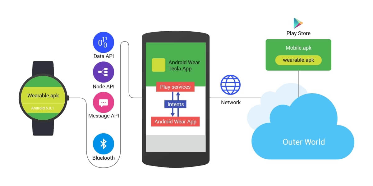
Having full-fledged Android OS inside a watch has both advantages and drawbacks. The same system on the phone and the watch eliminates any gaps for the existing community of Android developers. This brings the power of all the existing libraries, animations and SDK features to a small screen. In our opinion, this is the main advantage of Android Wear. Almost everything was familiar to us. It was just a matter of new Android UI Views and several days of documentation and tutorials. The Bluetooth stack is completely hidden from developer’s eyes behind wearable APIs. Basically, learning was like investigating another Android library.
On the other hand, the Android OS brings lots of overhead to the tiny smartwatch world. It drains battery. Lots of battery. That’s why Pebble still rocks: they created a custom-tailored OS with limited features, but it provides an awesome smartwatch battery range.
Another drawback was that Android SDK documentation leaves much to be desired. When we faced unexpected issues, we always searched for solutions at Stack Overflow. It has proven to be the best place for all undocumented sides of Android SDK.
Google did a great job by just extending the existing Play Services library with Wearable features. Making your app compatible with Android Wear requires almost nothing. If you use notifications, they work straight out of the box. No work required. You can give them a lot more wearable context by just adding Wearable features to the existing notifications via WearableExtender class.
Because both devices run the same OS, we could easily share code and some business logic between wearable and smartphone projects inside a common library. Thanks to the gradle build system, development and deployment was straightforward and easy to set up. The availability of several real devices made it possible to try everything out in real life, not only on an emulator. This was a big advantage comparing to our Apple Watch Tesla App research, where only emulators were available.
Summary
Android Wear was released during Google’s I/O conference in June. After the presentation, we had the impression that Google is very proud of the way Android is evolving. It felt like Google created a platform that can be embedded into anything: cheap phones, high-end phones, smartwatches and even cars. We left the conference with a thought that if Google was to create a refrigerator, they would put Android inside. That’s what they did with Android Wear - put Android inside a watch.
But before the release, there was only a nice video ad and an emulator package, which had keyboard instead of voice input. Today Android Wear gives us plenty of opportunities. This gives us hope that Apple Watch will evolve into something meaningful and that its limitations are also temporary.
If you’re interested in application development for Android Wear, Apple Watch or Pebble, feel free to contact us.
Related Insights



The breadth of knowledge and understanding that ELEKS has within its walls allows us to leverage that expertise to make superior deliverables for our customers. When you work with ELEKS, you are working with the top 1% of the aptitude and engineering excellence of the whole country.

Right from the start, we really liked ELEKS’ commitment and engagement. They came to us with their best people to try to understand our context, our business idea, and developed the first prototype with us. They were very professional and very customer oriented. I think, without ELEKS it probably would not have been possible to have such a successful product in such a short period of time.

ELEKS has been involved in the development of a number of our consumer-facing websites and mobile applications that allow our customers to easily track their shipments, get the information they need as well as stay in touch with us. We’ve appreciated the level of ELEKS’ expertise, responsiveness and attention to details.

