Behance Portfolio Review is a significant event and a wonderful opportunity for designers of all shapes and sizes to interact and share experience locally. With our strong UX team, ELEKS has already hosted Behance Portfolio Review last year, and this year we wanted to make it really memorable. But here’s the problem: hundreds of Behance Portfolio Reviews are hosted around the world all the time. How can we make ours special? Two words: Microsoft Kinect.
ELEKS Behance Portfolio Review Kinect Installation from ELEKS on Vimeo.
We experimented with touch free interaction to develop our own unique design patterns. And in this article we will recount ELEKS’ successful experience with the Microsoft Kinect motion technology and share how the interactive installation with Kinect helped us boost audience engagement.
Since organizing the event required both technical and design skills, the article has two parts. Click here to go directly to the User Interface part.
The Technical Part
The most common way to develop applications with rich UI that can interact with Kinect is to use WPF. It integrates well with Kinect SDK, has good controls and available interaction schemes. That’s why we started the setup this way. Unfortunately, we quickly reached the point when WPF became a restriction rather than an advantage. The problem wasn’t technical in fact, since, if dealing on the high level, WPF is a very powerful UI library that enables building almost any UI paradigm. But if you’re just about to add parallax effect for a certain background, it leaves you virtually no options. And it’s not like the case with HTML, when you can find dozens of well-designed and well-maintained libraries. All these restrictions were among the reasons that pushed us to change our minds and take a different approach.
And here are the different approaches we used for creating our interactive installation.
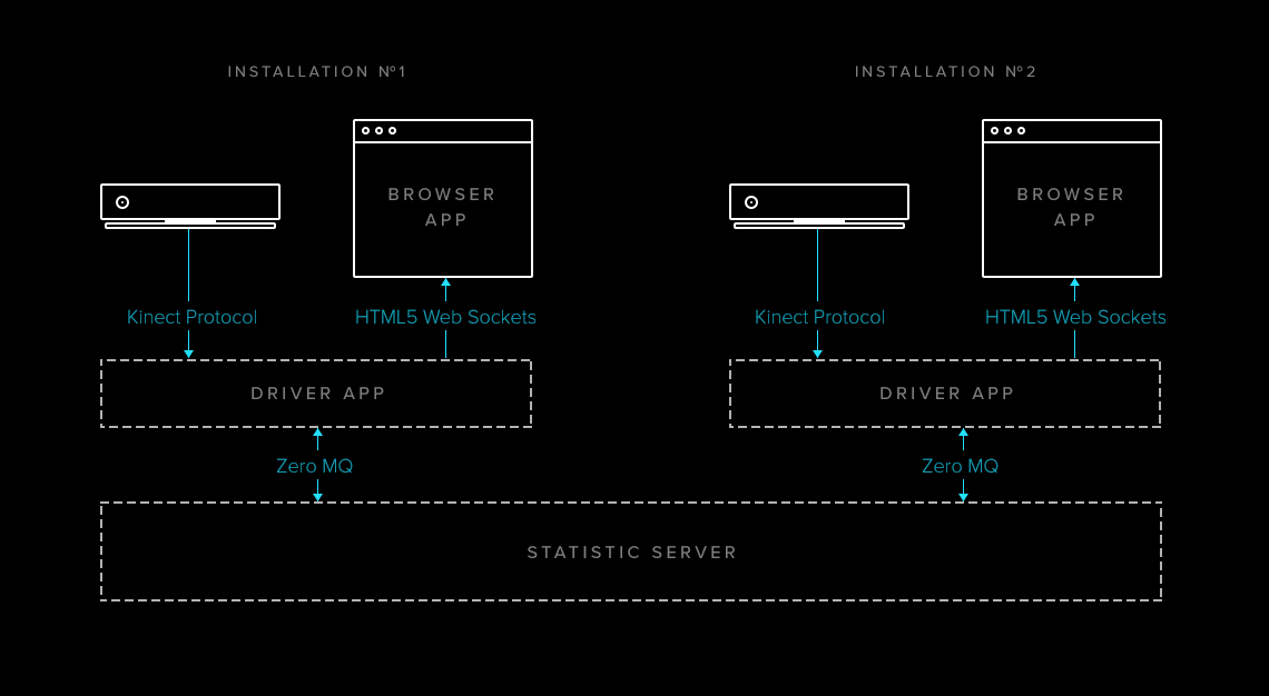
1) We replaced WPF with HTML5 for the UI. As the JavaScript application framework, we decided to use AngularJS. But we had an issue with communication between the driver application and the HTML application. Obviously, it had to be very fast. Any lags between a person’s move and the actual response of the UI will be more than noticeable. This time we decided to take the best of HTML5 Web Sockets. Fortunately, it was fast enough to send video source as a raw binary image for each frame. And yes, without any noticeable lag. Even more, it works on any modern browser. As a result, we received a JS HTML5 application using AngularJS and HTML5 Web Sockets for communication.
2) We replaced the interface with HTML5, as we couldn’t use WPF controls from Kinect SDK. We went on with more interesting ideas. One of them was to make the UI based on swipes instead of the grab-and-drag interactions from the Kinect SDK. In the first version we used for the Behance Portfolio Review event, we implemented swipe detection that took the last 20 points of the left hand move and tried to match it with some patterns. A more advanced version where we use Kinect SDK 2.0 Visual Gesture Builder is on the go. To be more specific, it uses an Adaptive Boosting machine-learning algorithm to distinguish a swipe gesture. Now we can also detect more gestures and track how users move. But this is another story to tell.
3) The driver application built from the inside. The driver application has a number of “emitters” that produce events as a response to user activity and certain internal actions. Examples of events are SwipeToLeftDetected, UserModed, UserEngagaged, UserLost, StatsUpdated, etc. The events are published to specific channels and built with Reactive Extensions. After filtering and improvement, a number of events is streamed to HTML Web Socket and finally handled by the HTML5 Application. One more group of events is streamed to Statistics Server and the last one is used to control the Kinect connection and infrastructure needs. Generally speaking, it was quite a pleasant experience with Reactive Extensions and the way they behave as a communication medium for the application.
4) Statistics Server. The idea here was to connect two or more installations into a single system. For example, when a person likes a project during the first installation, other installations are aware of it and update the UI accordingly. From the technical perspective, it uses ZeroMQ for communication between nodes, though we used the Pub/Sub channel to notify installations of the changes in statistics and Push/Pull for one-way communication.
The User Interface Part
Since this was the second time we hosted the Behance Portfolio Review, we knew a thing or two about the possible issues that might appear during the event. But this time we really wanted to attract a bigger audience and give the authors an opportunity to see live feedback on their works and review the works of others.
The first thing that crossed our minds was to print out portfolios, but it would take plenty of time to prepare files and print them out. And what about digital designers? Printed websites or mobile apps were also not the best idea – it’s screen, not paper that makes them fancy. That’s when we turned to Behance API. The projection of designers’ works on the walls during the event looked good, but we wanted to go even further, to interactive reviewing of portfolios. That’s how we came up with the idea to apply our expertise in IoT software development to create a Kinect Installation.
Kinect gave us the perfect opportunity to use a body as a controller, so our guests wouldn’t have to connect to use the installation in any way; all they had to do was approach it and the interaction began. Cool, right? But, as it often happens, the implementation was more difficult than it seemed at first.
Natural User Interface has limitations on both sides. First of all, it’s about technological limitations. Not all the gestures were well-detected. For the first prototype of the installation we used simple swipe and drag gestures to navigate through the listed showcases. But even the simplest left/right swipes wouldn’t work properly and the movements had different trajectory each time. Besides, it’s quite difficult to detect swipe left after swipe right movements because after swiping right you naturally move your hand back to the left, whereas Kinect can detect it as swipe left. Naturally, there would be no consistency in user experience. Also, no one would teach users to make movements “in a right way,” that’s why we chose as simple and intuitive gestures as possible. Even in the second version of our installation with Kinect v2, we choose only one bulletproof drag gesture. Yes, Kinect v2 has better camera, machine learning capabilities, but still, swiping one hand right and left is not always working.
We planned to make the appreciation mechanism very similar to the one on the Behance platform plus a simple “like” gesture. Unfortunately, even Kinect v2 did a poor job at detecting the “like” gesture people made with just thumbs up. But there's no great loss without some gain. In our case, the gain was big, because we came up with a gesture that appeared even more interesting – thumbs up + hands up. From the technical perspective, it's safe and easy, while the experience is more fun and interactive.
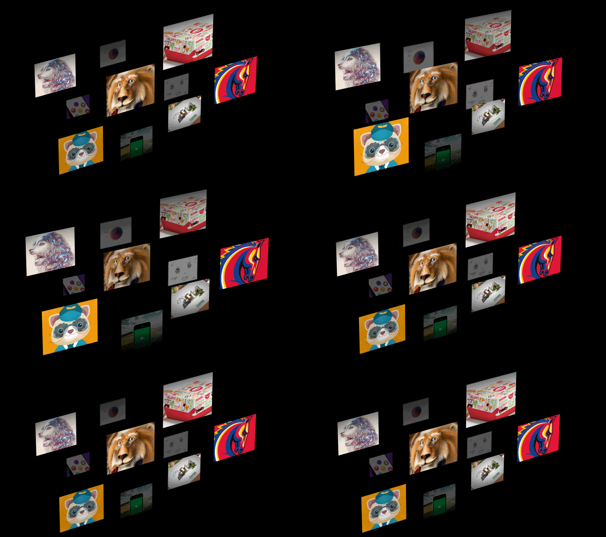
We created a 3D environment with the most appreciated showcases shown in the first place to give our audience an opportunity to vote for the best of the best. The 3D environment expanded the physical space with the projection shown on a dark background, which visually deepened the wall.
A curious thing about the NUI was that usually there are no buttons or active elements and this fact poses certain design challenges like how to highlight elements using only animation and visual aspects. For our installation we created a simple gallery that appeared after user initialization and used fade on sides of the elements to help users understand how to interact with the installation.
Another challenge we faced was the feedback. It wasn’t hard to make the feedback gesture, which can’t be said about user interaction. It could have gone wrong when two or more users appeared near the installation, particularly in the interaction zone. How do you show or identify the active user? As we used 3D space for the UI, we rotated the whole interface to the active user, showing that other people are inactive. It also gave the feeling of live interaction and enhanced user experience.
Finally, to make user experience even better, we used lots of animation to visualize and provide immediate feedback on each user action.
Summary
The Behance Portfolio Review organized by ELEKS was a blast thanks to the live interaction with portfolios via Microsoft Kinect! And if you are planning to use Microsoft Kinect in your events, here are some tips:
- Use as simple gestures as possible. Better only bulletproof.
- Provide immediate feedback.
- Use animation to make your UI “alive”.
- Think about the physical space.
You can find the code we used to create this magic on our GitHub repository.
If you need expert advice and assistance in building engaging experiences for your events, don't hesitate to get in touch with us.
Related Insights




The breadth of knowledge and understanding that ELEKS has within its walls allows us to leverage that expertise to make superior deliverables for our customers. When you work with ELEKS, you are working with the top 1% of the aptitude and engineering excellence of the whole country.

Right from the start, we really liked ELEKS’ commitment and engagement. They came to us with their best people to try to understand our context, our business idea, and developed the first prototype with us. They were very professional and very customer oriented. I think, without ELEKS it probably would not have been possible to have such a successful product in such a short period of time.

ELEKS has been involved in the development of a number of our consumer-facing websites and mobile applications that allow our customers to easily track their shipments, get the information they need as well as stay in touch with us. We’ve appreciated the level of ELEKS’ expertise, responsiveness and attention to details.

